Whether a black and white powder room or stucco-accented master bath, there are myriad ways to create contrast in a bathroom. Contrast is important not just for creating a more interesting space, but also for making a room feel larger, brighter and more inviting. Here, we explain the many functions of contrast in the modern bathroom, and how to create a bold look through texture, color and pattern.
Designing a High Contrast Bathroom
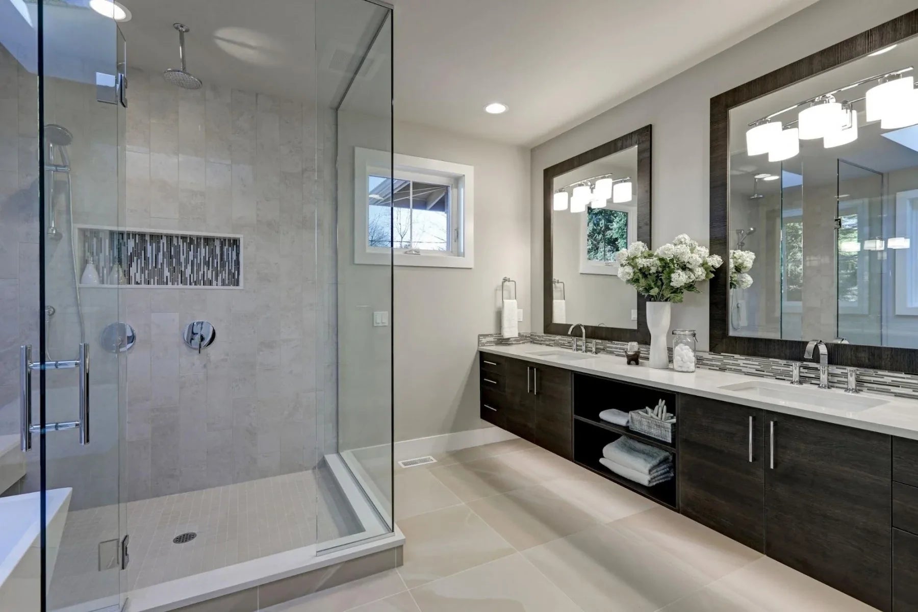
Learning how to create a high contrast bathroom requires an understanding of what interior contrast is. Low contrast spaces tend to be more monochromatic, such as the neutral spaces hallmarked by Scandanavian design, says interior designer Eleanor Busing.
High contrast bathrooms create a bold look that draws the eye. In a bright room, having larger, more concentrated items in dark colors boosts the contrast. The key to understanding contrast is looking at the difference between the lightness and darkness in a space, Busing adds.
A low-contrast space is referred to as a tonal interior, says interior designer Will Taylor. “This often creates a relaxing and soothing space, but it's important to layer in pattern and texture throughout the space to create visual interest.”
On the other hand, a high-contrast space features complementary colors, such as blue and orange. Since this look can get overpowering quite quickly, it’s important to use one color as the base and the other as an accent.
The team at Marc-Michaels Interior Design points out the role of texture in creating this effect. “Conscious and compatible conflict is sometimes the key to using texture in interior design. Two materials when you hold them apart separately seem incongruent and incompatible in texture, but combined in the right space surprisingly create dramatic harmony.”
Texture creates drama and emotion that people can feel when they walk into a room, they explain. This is the heart of why texture creates uniqueness in a home and helps it stand out from the ordinary.
Overall, creating a tasteful high contrast look comes down to balance. Shiny fixture finishes in the bathroom adds zing, says home decor writer Michelle Ullman. However, too much can come off as harsh or tacky, creating a space that doesn’t feel cozy. She says that things like shiny door knobs, polished glass, metallic trim and extra mirrors should be added to a room mindfully.

Creating Contrast with Layers
We usually think of texture as being a tactile element: something we can touch and feel. In the context of interior design, texture is also about adding visual interest and balance to a space.
“There are different types of texture you can add, such as reflective, tactile and natural. Incorporating a mix of textures within a space ensures you will captivate anyone that enters it,” says interior designer Maria Jones. It’s important to mix up the textures in a space to create a balanced look that, while interesting, doesn’t overstimulate the senses, she adds.
Texture doesn’t always have to be an object in the room, either. According to Christina Samatas and Renee DiSanto of Park & Oak Interior Design, texture is about layering. “When we talk about adding texture, we are referring to the layering of various textiles, materials, colors, and metals in a space.” For example, contrasting metal and wood, or adding a sofa in pink velvet against a pink wall, are simple ways to create more texture.
Textured walls and floors are also becoming more popular. These elements can serve as the foundation for an entire design scheme before accessories are chosen, says Emily Bird at The Lux Pad. She adds that marble tiles, concrete floors and wall finishes can serve as excellent starting points for layering rougher, more raw textures such as wood.
Understanding the relationship between texture and light can also determine the level of contrast in your bathroom, says Caroline Modig at Art Hide.
Since smooth, reflective materials bounce light around, they tend to make a space feel bigger and brighter. Mirrors, gloss-finish tile and tapware can all play a role in boosting light in a room while making nearby colors look deeper and more saturated. Alternatively, rougher textures like unpolished stone and wood absorb light to make a bathroom feel warmer and more comfortable.

High Contrast Paint
Paint is an invaluable tool when creating a high contrast color scheme. Denisa Luntraru at Daily Dream Decor agrees that using a complementary color scheme is the best way to create high contrast. Incorporating colors from the opposite side of the color wheel creates dramatic impact, she says. There are many ways to create this effect, such as black and white or yellow and purple. If opting for this approach, it’s best to choose one color for the walls and one color for furniture and accessories, in order to maintain balance.
Having a high contrast space doesn’t mean you have to paint the walls black and have all-white furniture. Graphic designer and branding coach Jeanette Lockmiller says one simple way to create contrast in the bathroom is the use of doors. “Doors are a perfect opportunity to add contrast and visual interest using contrasting colors or shades of grey. I’ve become a huge fan of black doors against bright white trim,” she writes.
Another more unexpected way to create contrast is by playing with hues that are close in color, such as indigo and black. Interior designer Windsor Smith shows how a black wall and indigo textiles create intrigue. The dark elements are contrasted in a living room with a bright white couch, which highlights the tension between the two colors, she says. In a bathroom setting, a black wall and indigo vanity could be contrasted with a white marble countertop.
High Contrast Patterns
Patterns are another core element when creating a high contrast bathroom. While there are many ways to use patterns, a few classic design rules can ensure you use this design element with class.
To avoid clashing, for example, stick to a specific type of pattern to create cohesion in a space, says interior design writer Deidre Sullivan. As a rule of thumb, the boldest pattern in a space should cover the floor. While this often means a standout rug in living spaces and bedrooms, it usually means patterned tile in a bathroom, she explains.
Consider the bold look of the Moroccan patterned tile in a bathroom renovation by Katie Sullivan. Having a high contrast pattern on the floor offers far more intrigue than ordinary solid tile. Moreover, this look is elevated with the white subway tile on the walls of the bathroom.
Wallpaper can also do the trick when seeking a high-contrast bathroom. Just because you’re designing a bathroom doesn’t mean you have to stick to traditional wallpaper usually seen in powder rooms. In fact, wallpaper designed for different purposes may offer more colorful, creative contrast.
Interior designer Liz Foster suggests using children’s wallpaper in the bathroom for a fun, unique look. Her favorites include muted patterns, such as a pale pink paper adorned with cactuses, a bolder striped wallpaper patterned with flamingos, and a dark navy blue wallpaper featuring illustrations of foxes and pine boughs.
Images by: iriana88w/©123RF.com, skdesign/©123RF.com, Elnur Amikishiyev/©123RF.com