Designing or remodeling any bathroom is a challenging and time-intensive endeavor, and helping someone else do it can be even difficult.
How do you determine which colors will work well in a space you’ve never seen? What’s the best way to choose bathroom fixtures that meet a client’s everyday needs?
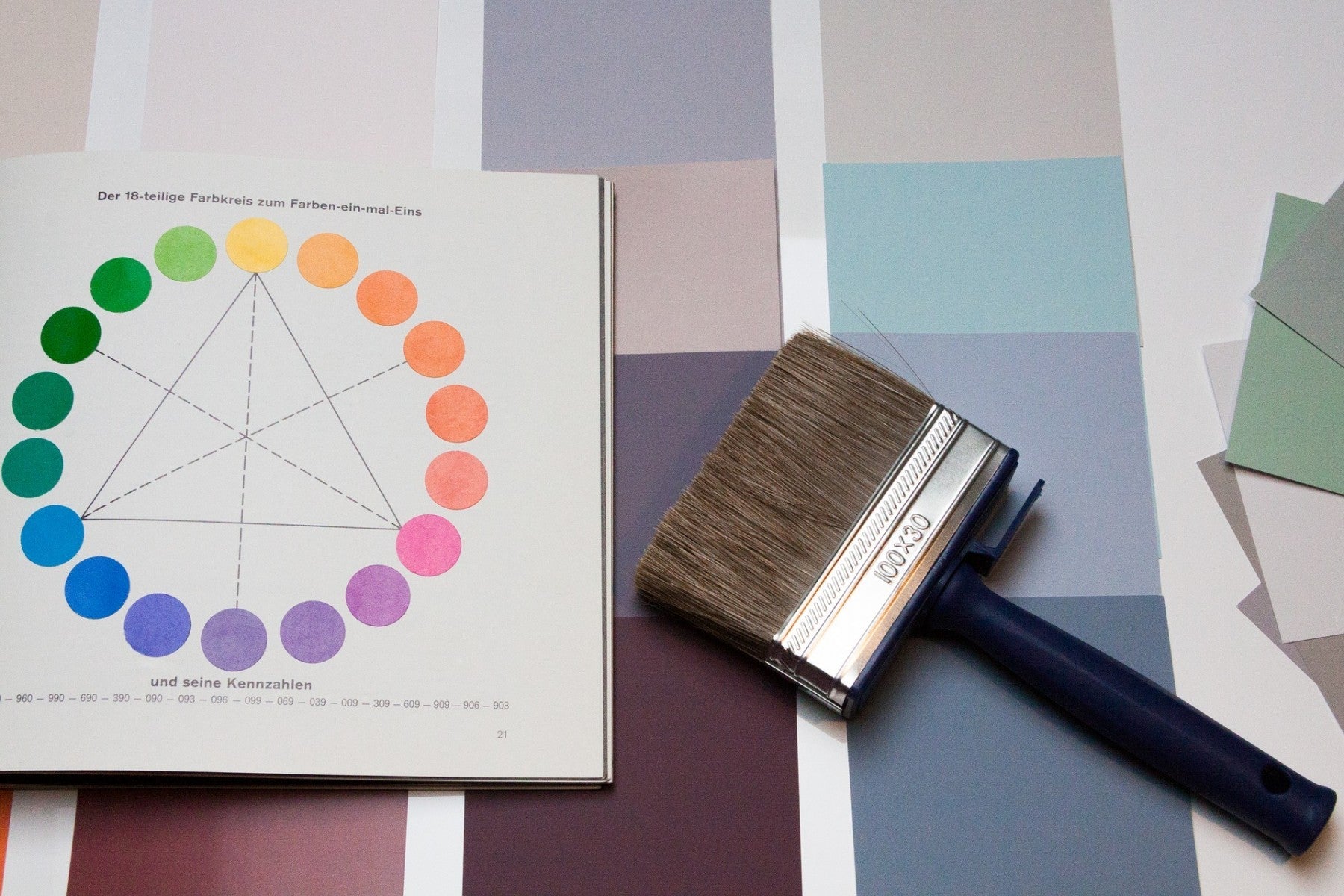
When faced with these design questions, a color wheel can be invaluable. To help your clients find the perfect palette (and bathroom fixtures that match), here’s how to use the handy tool on the sales floor.
Color Theory Basics
Using a color wheel leads into conversations about how a buyer visualizes their bathroom. This will help guide that customer to the palettes and shades they’ll be most happy with. All Bathroom Designs says that lighter colors make a room feel larger, while darker colors create a more intimate feeling.
Alternatively, layering light and dark shades can create a dynamic feel that evokes many emotions. Warm and cool shades also have a powerful effect on the mood of interiors. Mihir Patkar at Lifehacker explains that warm colors exhibit energy, joy and intensity. Cool colors, on the other hand, convey peace, calm and relaxation.
You can also use the color wheel to open discussion about who the bathroom is for. The private bathroom of a business executive is going to look much different than that of a high school student.
Julie Kircher at Furnish My Way says that dark blue evokes authority and success, which would be perfect for professionals and career-minded people. On the other hand, yellow creates feelings of inspiration and positivity — emotions a teenager might benefit from. Since the color wheel can easily be split into warm and cool colors (as pointed out by DIY Doctor), knowing the user and desired effect of the bathroom can help you narrow options and simplify the process.
Using a Color Wheel
Using a color wheel can greatly speed up a bathroom design and remodeling project (and help your customer avoid ghastly color mistakes).
Kelly Roberson at Better Homes & Gardens writes that to start, it’s best to choose three key colors for any room. This means selecting a neutral color, an accent color and one rich color. Since interior design relies on the interplay of varying complimentary shades, making color decisions before buying any fixtures or hardware will help ensure a smooth remodel.
The team at Bathroom Frills breaks down multiple aspects of the color wheel, including neutral colors. Since most bathrooms incorporate at least one neutral hue, it’s a good idea to plan rich colors and accent colors around a white, tan or other neutral that really resonates with the intended theme.

To get started, Patricia Palermo at Ballard Designs says that you can choose either a monotone, analogous or complimentary color palette. Monotone palettes use the same color in varying shades; analogous palettes partner three palettes that are side by side on the color wheel. Nike editor Cedar Pasori says that analogous palettes create a sense of unity, especially when the same intensity is used.
Lastly, complementary colors are those directly opposite one another on the color wheel. These tend to create the best color pairings, Pasori writes, especially when you want a more colorful look. Juxtaposing different hues also changes the way colors and rooms register in a person’s mind.
Customers can also opt for a triadic scheme, which draws from three colors that are evenly spaced around the color wheel. DIY Bathroom Remodel explains that this creates a bolder visual contrast and stands out more than a complementary scheme. Another variation is a split complementary scheme, which takes the same principal as a complementary strategy by drawing a direct line across the color wheel. However, this technique uses two colors side by side in addition to one color across from them.
Color Considerations
Helping someone choose interior colors brings with it certain responsibilities.
For example, Douglas Trattner at HGTV says it’s important to be aware of simultaneous contrast of color. This is a phenomenon when colors appear different based on how they’re paired. So if a client likes the way a color looks when it’s picked out, they may not like it when it’s paired with another color. The combination of the two shades can sometimes be jolting for a room’s occupant, which why it’s so important to keep in mind the bathroom design’s intended mood.
Also remember the visual effect colors can have on a person’s reflection. Interior designer Jane Lockhart explains that bright colors might seem like a good idea at first, but can cause problems later down the line. Specifically, colors like lime green or yellow can dull a person’s reflection in the mirror. If the bathroom will be used by the client for getting ready to go out, then it’s important to stick with neutrals that brighten reflections.

Popular Pairings
A customer may have their exact color combination in mind before they come looking for tubs, sinks and more. But if they don’t, it’s important to know what combinations and trending and popular so that you don’t have to rely on the color wheel alone. Understanding trends and approaches can also help guide your customer towards something they didn’t even think of.
Designer Lucy Attwood at MyKukun shows how yellow and purple are complimentary, helping create a bold bathroom scheme that reflects loyalty. Opting for a soft yellow and a lavender can keep things cool and calming while still remaining colorful and interesting.
Additionally, blue is always a popular bathroom color, and today’s designers are pairing this classic color with bright, warm colors that spice things up. Cypress Design says that pairing orange tones with blue gives a big impact with a limited color palette. A subtle, yet powerful way to add orange is to incorporate wood that has orange tones streaked within it. This still gives the dynamic impact of orange and blue while keeping the overall theme natural and approachable. If it’s a small bathroom that needs color help, Sacha Strebe at MyDomaine suggests going all out with dark, bold colors.
People are used to seeing white and neutrals in a small bathroom, and it’s true that this can help the space feel larger. However, opting for something like an inky blue can look chic, dramatic and intriguing.
If a client is set on using neutrals, consider using them as accent colors. Granite Transformations shows how varying shades of a neutral color reflects a sophisticated, classic look without coming across as dull. One example is a shower wall in a coffee-colored tile mosaic with the rest of the bathroom muted, and the whole tied together with subtle tan accents.
Images by: Stefan Schweihofer, Eduardo Silva Barbosa, Polski