Bored of the plain white minimalist look? Yawning at the sight of scandi-boho shower curtains? It’s time to tune into the new bathroom color trends dominating interior design this year. From bright corals and oranges to deep, inky navy, these are the bathroom color schemes to watch in 2019.
Inky Blue-Black with White Pops
Blue is a classic bathroom design color, and black bathrooms have emerged in the past year, too. Upgrading your bathroom in 2019 is all about combining these colors to create a sophisticated, blue-black shade, says Lucy Searle at Realhomes.com. She adds that color blocking is an effective technique to make any room seem larger and taller.
In the example photo she provides, a freestanding white tub elegantly pops against the half blue-black wall in the background. Pairing blue-black with white fixtures, or using a white border edge to break up space between color blocks, helps the space maintain its natural light despite the dark color.
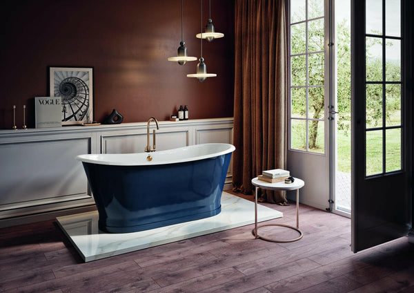
Moody navy bathrooms are also back in style, notes home decor writer Ashley Knierim. Rich, deep colors might not open up a space like white walls do; however, they add personality and intrigue in a way lighter colors simply can’t. Knierim showcases a dark blue she says would work especially well for powder rooms.
One example of a strong navy color is Benjamin Moore’s Hale Navy. Canada-based homebuilder Bradley Homes points out this is a timeless, classic color. “This deeply saturated shade of navy blue evokes rich maritime traditions and storied exploits at sea.”
Half baths and powder rooms would also look stunning drenched in a color like Hale Navy.
Behr’s Blueprint
Similar to Pantone, Behr paint introduces an official color each year. Behr’s 2019 color is named Blueprint.
“If you’ll allow me to draw a parallel to blue jeans, it’s that perfect middle of the road blue denim color- not too dark, not too light, slightly worn to keep it comfortable, but with enough color to be easily dressed up,” says Behr’s project manager Quinn Larson-Pierce.
Pairing Blueprint with pastels create a calming effect in the bathroom. Behr shows how the color works with a light grey, a light lavender and a peach color in its color scheme ideas chart. It creates a harmonious contrast when paired with bright white, too, as showcased by Kris Jarrett, the founder of Driven by Decor. While shown an an accent wall in a bedroom, this look would suit a bathroom perfectly. Painting the accent wall behind a freestanding tub, for example, would have a similar design feel to the accent wall behind the bed.

PPG’s Night Watch
Today’s consumers are interested in reconnecting with nature which is why green is so popular in bathroom design trends today and moving through 2019, explains trade fair and event organizer, Messe Frankfurt. While green color schemes can range across many different hues, from pastel mint to deep spruce, they all provide a fresh, healthy ambiance similar to the great outdoors.
Moreover, PPG’s Night Watch is a black-infused green designed to make people feel healthy, calm and grounded. “The dark green hue pulls our memories of natural environments to the surface to recreate the calming, invigorating euphoria we feel when in nature,” says Dee Schlotter, PPG senior color marketing manager.
Bringing the outdoors inside through color is one of the best ways to create a spa-like bathroom
promoting serenity and rejuvenation. For this reason, it works particularly well in bathrooms that don’t have large windows or are lacking in natural light.
Night Watch works well with millennial pink and other blush tones that are popular throughout the home today. It makes a striking accent wall when paired with white, notes Apartment Therapy’s Bridget Mallon.
Pantone’s Living Coral and Neutrals
Similar to Night Watch, Pantone’s 2019 color, Living Coral, is inspired by the beauty of nature.
“It pulls you in, gathers you in, in such a warm and inviting way that it opens up an avenue to positive thoughts, not negative. That, we felt, was a really vital part of expressing the Color of the Year with Living Coral,” explains Leatrice Eiseman, Pantone Color Institute’s executive director.
That said, Living Coral is such an enveloping color it can stand on its on. A bathroom in Living Coral showcased by Chelsea Jackson at SF Girl shows how the color only needs small pops of contrast, like a white tub and brass fixtures. The warm undertones would also compliment copper, and white helps neutralize the entire look.
To incorporate Living Coral in a more subtle way, consider accessories. Diana Hathaway at Freshome.com recommends adding toiletries and accents in Living Coral to gently introduce the new color. She also says it’s an easy addition to a color scheme that’s already neutral. If your bathroom is white, gray or beige, Living Coral accents are an easy way to introduce a bold color.

Orange Hues
Those who embrace 1970’s design style will fall in love with the orange and white color schemes growing in popularity today. Real Homes staff writer Hebe Hatton shows an example of wallpaper with a vintage-inspired orange and white floral design. The bright orange tub draws attention to the orange flower wallpaper and compliments the warm tones of the wooden vanity and brass side table. White and off-white work wonders together, especially in older homes that need a creative upgrade.
Another orange bathtub is found in a bathroom photographed by Michael Sinclair. The neutral wall pairs well with the juicy orange roll tub for a satisfying, yet unexpected combination. Whether it’s an orange sink, tub or wall, it’s important to balance the boldness of this color with something light and airy, as seen in this example.
Orange tones can also be mixed with Pantone’s Living Coral. As showcased by Valspar’s senior color designer Sue Kim, coral can be separated into orange and pink counterparts to add variety and energy to a room. She shows how a windowless bedroom is greatly enhanced by this alternating color scheme idea. Similarly, this technique could bring energy and positive vibes to a bathroom with no windows or little natural light.
A more subtle incorporation of orange can be found in this example from Cyndy Aldred, founder of The Creativity Exchange. Here, wallpaper with orange tigers contrasts a dark gray background and black cabinetry. The gilded mirrors and white tile add a lightness to this contrast and help tie the orange patterns and the plain black together in a way that feels exotic and old-world, rather than reminiscent of Halloween.
Farrow & Ball’s Borrowed Light
Farrow & Ball’s Borrowed Light is a pale blue that works in both bright and dark spaces.
The team at says Palette Paint and Home says Borrowed Light is “gorgeous in spa-like bathrooms, soothing bedrooms, and a hands down favorite on interior ceilings and porches.” There’s no denying it’s perfect for creating a relaxing, airy bathroom that helps daily stressors dissipate.
Silver fixtures, such as chrome and nickel, look stunning when paired with this color. One example of a spa-like bathroom in Borrowed Light was designed by William MacDonald, owner and principal of WillMac Design. Scroll through the penthouse images to see the bathroom ceiling and walls in Borrowed Light, balanced with white floors and a white tub and vanity. Silver light fixtures, tapware, hooks and drawer pulls add a touch of shine and reflectivity to an already soothing space.
Images by: Tookapic, Hoang Loc, Moose Photos